
Учебное пособие Издательство Томского политехнического университета 2009
| Вид материала | Учебное пособие |
- Редакционно-издательским советом Томского политехнического университета Издательство, 1434.78kb.
- Редакционно-издательским советом Томского политехнического университета Издательство, 3189.24kb.
- Редакционно-издательским советом Томского политехнического университета Издательство, 2424.52kb.
- Редакционно-издательским советом Томского политехнического университета Издательство, 2585.19kb.
- Редакционно-издательским советом Томского политехнического университета Издательство, 1488.99kb.
- Учебное пособие подготовлено на кафедре философии Томского политехнического университета, 1526.78kb.
- Учебное пособие Издательство Томского политехнического университета Томск 2007, 1320kb.
- Учебное пособие Рекомендовано в качестве учебного пособия Редакционно-издательским, 2331.42kb.
- М. В. Иванова Томск: Издательство Томского политехнического университета, 2008. 177, 2610.26kb.
- Я управления рисками в организации рекомендовано в качестве учебного пособия Редакционно-издательским, 1160.94kb.
4.7.3. Neo-primitivism
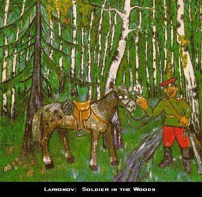 In the West, Neo-primitivism was an aftermath of the exhibition of the folk arts of Africa, Australia, and Oceania in Paris. The world of art was surprised by the boldness of colors, originality of designs, and the expressiveness of these “unschooled,” spontaneous creations of the “primitives.” In Russia, flourishing between 1907-1912 and officially launched at the 3rd Golden Fleece Exhibition in 1909, Neo-primitivism was championed by Natalia Goncharova and Mikhail Larionov, although many other artists went through a Neo-primitivist stage. The genesis of the style can be found in the folk art of Russia - such as the lubok (popular print) and peasant applied art (distaffs, spoons, embroideries), but even more in icon painting. Goncharova, Larionov, Malevich, Tatlin, even Chagall and Kandinskii incorporated into their works ideas and compositions common in icon painting. Neo-primitivist canvasses share with icons a pronounced one-dimensionality (flatness), lack of depth and perspective, distortions of “reality,” as well as a bold, striking colors. Although the forms are intentionally distorted and resemble children's pictures, the paintings' rhythm and harmony come from "the music of color and line". Larionov's Soldier in the Woods (1908-9), an early example from the Soldiers series, deliberately violates the laws of perspective by making the surface of the canvas flat and decorative. The proportions of the composition are distorted - the horse is small and the head and hands of the soldier are unusually large. Moreover, Larionov employs a limited number of primary colors, applied without shading and blending. All these artistic devices find parallels in the art of the Russian folk, particularly in icons, street signs, wooden toys, decorated distaffs, and lubok (usually hand colored in red, green, purple, and yellow).
 4.7.4. Rayonism
Rayonism, an ephemeral style which lasted only about a year, was not o
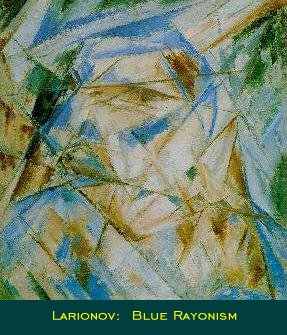 nly unique to Russia, but to the entire world. It was invented by Mikhail Larionov and practiced mostly by him and his companion Natalia Goncharova. Introduced to the public in 1913 at the Target exhibition, Rayonism was described as “naturally encompassing all existing styles and forms of the art of the past, as they, like life, are simply points of departure for a Rayonist perception and construction of a picture”. The central feature of Rayonism is the “crossing of reflected rays from various objects;” to this end, its most powerful tools are color and line. Although short-lived, Rayonism proved to be a crucial step in the development of Russian abstract art. As Larionov said, it represented the “true freeing of art” from the former “realistic” conventions that had so “oppressed” the artistic community.
 John E. Bowlt suggests that Larionov's Rayonist theory might have been influenced by the developments in photography and cinematography: "In 1912-13 the Moscow photographer A. Trapani invented the photographic technique of "ray gum" - a version of the gum-arabic process - which enabled the photographer to create the illusion of a radial, fragmented texture. . . . Of possible relevance to Larionov's theory of Rayonism was the peculiarly “broken” texture that Mikhail Vrubel favored in so many of his works in the 1890s and 1900s - a technique admired by a number of young Russian artists. Moreover, Vrubel's theory of visual reality came very close to Larionov's formulation, as the following statement by Vrubel would indicate: “The contours with which artists normally delineate the confines of a form in actual fact do not exist - they are merely an optical illusion that occurs from the interaction of rays falling onto the object and reflected from its surface at different angles. In fact, at this point you get a 'complementary color' - complementary to the basic, local color . . .”
In 1913, in the miscellany Donkey's Tail and Target, Larionov published a pamphlet entitled “Rayonist Painting,” which contained an extensive description of the theory and practice of Rayonist art. Below are the most important excerpts: “We do not sense the object with our eye, as it is depicted conventionally in pictures and as a result of following this or that device; in fact, we do not sense the object as such. We perceive a sum of rays proceeding from a source of light; these are reflected from the object and enter our field of vision. Consequently, if we wish to paint literally what we see, then we must paint the sum of rays reflected from the object. But in order to receive the total sum of rays from the desired object, we must select them deliberately - because together with the rays of the object being perceived, there also fall into our range of vision reflected reflex rays belonging to other nearby objects. Now, if we wish to depict an object exactly as we see it, then we must depict also these reflex rays belonging to other objects - and then we will depict literally what we see . . .
Now, if we concern ourselves not with the objects themselves but with the sums of rays from them, we can build a picture in the following way:
The sum of rays from object A intersects the sum of rays from object B; in the space between them a certain form appears, and this is isolated by the artist's will . . .
Perception, not of the object itself, but of the sum of rays from it, is, by its very nature, much closer to the symbolic surface of the picture than is the object itself. This is almost the same as the mirage which appears in the scorching air of the desert and depicts distant towns, lakes, and oases in the sky (in concrete instances). Rayonism erases the barriers that exist between the picture's surface and nature. A ray is depicted provisionally on the surface by a colored line.” (Russian Art of the Avant-Garde, 93-100).
4.7.5. Suprematism
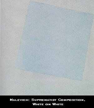
Suprematism, considered "the first systematic school of abstract painting in the modern movement", was developed by Kazimir Malevich in 1913 and introduced at the 1915 exhibition in St. Petersburg. Among other works, Malevich exhibited the famous “Black Quadrilateral on White”, conceived during his work on the opera “Victory Over the Sun” 3 years earlier. He wrote about the painting and about Suprematism in his treatise “The Non-Objective W
 orld”:
 “When, in the year 1913, in my desperate attempt to free art from the ballast of objectivity, I took refuge in the square form and exhibited a picture which consisted of nothing more than a black square on a white field, the critics and, along with them, the public sighed, “Everything which we loved is lost. We are in a desert . . . Before us is nothing but a black square on a white background!” . . . . Even I was gripped by a kind of timidity bordering on fear when it came to leaving “the world of will and idea,” in which I had lived and worked and in the reality of which I had believed. But a blissful sense of liberating nonobjectivity drew me forth into the “desert,” where nothing is real except feeling . . . and so feeling became the substance of my life. This was no “empty square” which I had exhibited but rather the feeling of nonobjectivity. . . . Suprematism is the rediscovery of pure art that, in the course of time, had become obscured by the accumulation of “things” . . . . The black square on the white field was the first form in which nonobjective feeling came to be expressed. The square = feeling, the white field = the void beyond this feeling. Yet the general public saw in the nonobjectivity of the representation the demise of art and failed to grasp the evident fact that feeling had here assumed external form. The Suprematist square and the forms proceeding out of it can be likened to the primitive marks (symbols) of aboriginal man which represented, in their combination, not ornament, but a feeling of rhythm. Suprematism did not bring into being a new world of feeling but, rather, an altogether new and direct form of representation of the world of feeling. . . . The new art of Suprematism, which has produced new forms and form relationships by giving external expression to pictorial feeling, will become a new architecture: it will transfer these forms from the surface of canvas to space. . . . Suprematism has opened up new possibilities to creative art, since by virtue of the abandonment of so-called “practical consideration,” a plastic feeling rendered on canvas can be carried over into space. The artist (the painter) is no longer bound to the canvas (the picture plane) and can transfer his compositions from canvas to space”.
As we can see, Malevich stresses almost endlessly that the name of the new style refers to the supremacy of pure feeling in art over art's objectivity. The simplest geometric forms - a square, a triangle, a circle, and intersecting lines - composed into dynamic arrangements on the flat surface of the canvas or into spatial constructions (sometimes called architectons) - are to express the sensation of speed, flight, and rhythm. In his 1918 “Suprematist Composition”, “White on White”, a step forward from “Yellow Quadrilateral on Whit” painted a year earlier, Malevich attempted to eliminate all superfluous elements, including the color; since in 1918 he virtually gave up painting, perhaps these experiments convinced him that he had reached his goal and could not develop his Suprematist ideas any farther.
Nevertheless, Malevich's ideas were so bold and innovative that despite the initial shock and fear, Suprematism quickly became a dominant style, espoused by both the public and the other artists, especially Rozanova, Rodchenko, Kliun, and Puni. And even though in 1919 the father of Suprematism announced the movement's demise, the reality-transcending and non-objective nature of Suprematism has had a great impact on the course of modern art.
4.8. Natalia Sergeevna Goncharova: The Evangelists (1910).
Natalia Goncharova was one of the first Russian artists to embrace “Neo-primitivism” - a graphic style reminiscent of traditional folk art. She explored it with a unique energy and skill, and was influential in making icon painting a source of inspiration for 20th-century Russian artists. In addition, Goncharova's works painted in this style are especially important as examples of a “synthesis” of European style and Russian national tradition.
“The Evangelists” are among Goncharova's first mature works devoted to a religious subject. The canvasses are remarkable for their skillful reconciliation of old and new influences in Russian art. Perhaps one of the most impressive aspects of these four paintings is their effective use of color, line, and composition to create a strong rhythmic whole. Goncharova manipulates these elements with such understanding and perception that when one looks at the four authors of the Gospels there are no distractions and no weak points - only strength and security in a modern interpretation of tradition and native style.
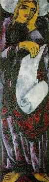
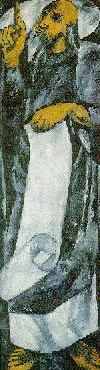
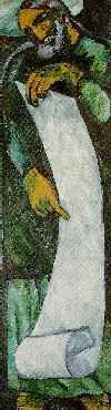
N. Goncharova. “The Evangelists”
Russian Museum, St. Petersburg.
Both line and color become here “expressive entities in their own right” and convey the sense of calm spirituality and wisdom treasured by icon painters. However, what the Neo-primitivists of Goncharova's time might have treasured most was an almost childish “directness and simplicity” characteristic of folk art, which they tried to imitate in their works. Today, the four paintings of the Evangelists may be admired for many reasons, and regardless of the basis for the viewer's appreciation, they definitely are an integral part of the Russian avant-garde movement.
4.9. Mikhail Larionov: The Fish (1906)
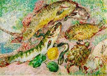 | “ The Fish” (often called “Fishes”), painted by Mikhail Larionov in 1906, was exhibited for the first time in 1909 as a part of the second Franco-Russian exhibition sponsored by the “Golden Fleece”. The painting shares particular qualities of color, light, and rhythm with many other works by painters of the Blue Rose group (Kuznetsov, Iakulov, Sar'ian, Goncharova, and brothers Miliuti). |
Collection of Mme A.K. Larionov, Paris
The blue-grey tones, characteristic of this period, are intermingled with light pinks, greens, and yellows to create a harmonious color scheme, held together by the dappling technique reminiscent of the French impressionists. An almost dancing rhythm seems to unify the shapes within one spatial plane. The hidden light source and liquid, fluid atmosphere employed in the works of the Blue Rose artists combine agreeably with Larionov's brushstrokes; in fact, on the left side of the painting the brushstrokes even imitate the scales on the fish, adding to the visual unity of the composition. Unlike the darker, more pessimistic or melancholy works of Borisov-Musatov, Larionov's work imparts a light, almost exuberant feeling of ease and freedom. The nonspecific background adds a subtle sense of mystery to the harmony of the scene. Is the fish on someone's kitchen table, ready to be prepared as a meal, or is it depicted a few moments after it has been caught, when the net of a fisherman opens and reveals the wonderful variety of underwater life?
The painting seems to be a whimsical still life with fish, a turtle, an eel, and a lemon; perhaps the lemon is there as a jocular reminder that fish and other frutti di mare usually go well with lemon.
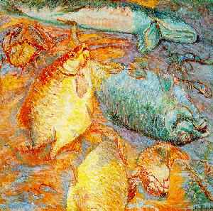 M. Larionov. M. Larionov. Fish at Sunset | “The Fish” and another painting on a similar theme, “Fish at Sunset” (1904) could be the proof that the shiny, shimmering, and highly reflective scales of the fish attracted the artist because he was fascinated with the phenomenon of light, which seven years later would lead him to the announcement of his rayonist theory and the abandonment of objective art (at least for a while). The earlier painting also shows a variety of sea creatures - several large fish, a crab, and a few lobsters. However, the light in both pictures is quite different. |
 sm.
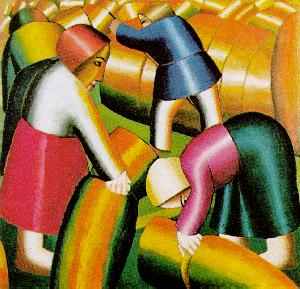
sm. 4.10. Kazimir Severinovich Malevich: Taking in the Harvest (1911-1912)
Oil on canvas, 72 x 74.5 cm. Stedelijk Museum, Amsterdam.
“Taking in the Harvest”, also known as “Taking in the Rye”, is one of the most “radical” expressions of the Cubo-Futurist movement. Though short-lived (lasting perhaps for a year or two), this movement is noteworthy for two main reasons: a) Cubo-Futurism was a movement unique to Russia b) most of the Russian artists of the period passed through the Cubo-Futurist phase before moving on to completely non-objective art.
Combining elements of French Cubism, Italian Futurism, and Neo-primitivism, Cubo-Futurism was more or less a natural stepping stone for Russian art as it began to free itself of European influences and once again established itself as a leading force in the development of the world art.
As one of the most creative and inspired artists of the Russian avant-garde, Malevich was well qualified to become one of the leaders of the Cubo-Futurist movement. “ Taking in the Harvest” expresses particularly well both Malevich's artistic temperament and the essence of the Cubo-Futurism. The color of the painting may be what strikes viewers most forcibly. The unnatural, bright metallic coloring is unexpected and, compared to other works of the time, perhaps a little shocking. If the color isn't surprising enough, however, the geometric quality of the figures certainly is - at least from a “realistic” point of view.
Though the painting is unusual, there is nothing incongruous or inharmonious about its form and composition. In fact, a kind of “cubo-dynamic rhythm” reigns here; one senses that the figures and the bales of rye depicted on the canvas really belong there. Every movement, every bend of a body, every curve fits - aesthetically as well as metaphorically. The simplicity of the work is also remarkable and, together with other Russian neo-primitivist paintings, harkens back to folk art and the icon painting tradition. Even the absence of perspective (except as indicated by the scale of figures) is reminiscent of icons. The impetuosity and the energy of “Taking in the Harvest” promises to propel the Russian avant-garde art in general, and Malevich's work in particular, into the unexplored dimension of abstract or non-representational art.
4.11. Mystical city group exhibition
Van der Plas Gallery, August 4 – September 10, 2006
Artists: Vasily Kafanov, Artem Mirolevich, Dimitri Semakov, Richard Buckler, Mary Westring, Yuliya Lanina
The Mystical City is an exhibition and event concept created by artists from the Mysticism in Art movement. Mystics sometimes claim to experience intuitive knowledge of transcendent dimensions beyond the phenomenal or material objects of ordinary perception. This movement’s main focus is to document and portray whatever is sparked within the artist’s imagination through the prism of his work. The artists work in different mediums: paintings, sculptures, photography, video installations, music and dance. In this exhibition artists will show their works inspired by the Mystical City concept. Mystical City is a creative concept and a symbol of a global city state philosophy that has been with our civilization for thousands of years. For many artists the Concept, City is more of an allegorical story or state of mind. The abstract neighborhoods, streets, and characters, which make up a city, are often used as the artists’ palate to create their own stories and personal utopias. This exhibition focuses on moving through time in the City - time and space being an essential element for creation of art. The artists of this movement hope to invoke interest and a spiritual hunger for mystical knowledge. They are on a journey of spiritual and creative discovery, searching for the answers, and believe that the search for reason becomes…
Translation practice
Летними вечерами жизнь в Seaport бурлит: концерты, люди, пиво. Но стоит подняться на второй этаж галереи Ван Дер Плас, и ты уже в другом мире — параллельном пространстве бесконечного города.
Mystical City - так называется открывшаяся в Сипорте групповая экспозиция работ шести русскоговорящих художников и одной американки. Семь разных взглядов, семь стилей, семь техник, семь миров, семь я выражены в таких непохожих работах художников из творческого объединения “Мистицизм в искусстве”, или это уже семья? “А почему бы и нет. Мы вот уже планируем и в общий дом перебраться - открыть свой музей где-нибудь в Бруклине”, - мечтает о будущем один из активистов движения - художник Дмитрий Семаков.
Василий Кафанов, Артем Миролевич, Дмитрий Семаков, Константин Гедаль, Юлия Ланина, Мари Вестринг и Юлия Шатерник — художники, открывшие для нас двери в параллельный мир мистического города. “Какой город был прототипом для ваших картин?” - спросила я Артема Миролевича. “Здесь отражен собирательный образ городов, в которых я жил и которые мне нравились: Нью-Йорк, Амстердам, Санкт- Петербург. И, конечно же, не обошлось без влияния древних городов и цивилизаций - Вавилона, Атлантиды и других”, - рассказывает художник. Его картины, как матрешки входят одна в другую: смотришь на одно полотно - оно кажется завершенным произведением. Переходишь к следующему и неожиданно для себя открываешь, что предыдущая картина была лишь фрагментом целого мира в новой работе, который, в свою очередь, может являться песчинкой в другой вселенной, изображенной на третьем полотне.
“У Артема очень графичные картины с невероятным количеством деталей. Я вижу на них бесконечный город мечты”, - рассказывает о своих впечатлениях от работ художников владелец галереи Адриан ван дер Плас. Он впервые разместил здесь такое большое количество картин русских художников. “Я уже пятнадцать лет успешно сотрудничаю с Константином Боковым, и работы русских художников мне нравятся. Я считаю, что они приходят в искусство с хорошим образованием, долго учатся и поэтому очень профессиональны”, - говорит о выходцах из России Адриан ван дер Плас. В картинах Дмитрия Семакова, например, он заметил отголоски стиля легендарного испанского живописца Эль Греко: “Арки, движения, фигуры, цвет - все мистично. Его работы напоминают мне классику Рима и колорит Эль Греко. Они переполнены энергией, экспрессивны и абстрактны”. Сам художник замечает, что сочетание арок и людей на его картинах отсылает к аллегорическому концепту входа. “Человек все время задает себе вопрос, стоит ли войти в эти ворота и узнать, что за ними тебя ожидает? Поиск ответа бесконечен”, - считает Дмитрий Семаков.
Не все из семи художников пришли в галерею на открытие выставки - разъехались по стране и миру. Но Юлия Шатерник не могла пропустить этого события. Для молодой художницы, два года назад приехавшей в Нью-Джерси из Минска, “Мистический город” - первая нью-йоркская выставка, в которой она участвует. “Когда мне сказали, что тема mystical city, я сразу подумала о цвете. Мне представилось, что работы должны быть в темных тонах. Вообще, гармония цвета - основное в моих картинах”, - говорит Юлия Шатерник. Она рассказала мне, что мистика преследовала ее уже с момента создания работ для этой выставки: она переворачивала полотно, и изображение вдруг приобретало глубинный смысл. “Эта картина мне не понравилась, когда я ее закончила, и я все соскребла, - рассказывает Юля о неожиданностях творческого процесса. - Муж увидел и сказал, что надо так и оставить”.
Другая Юлия - Ланина, несмотря на свою молодость, опытная художница, выставки работ которой проходят в разных странах мира. Вот и в этот раз она была в отъезде. Ее произведения – это удивительные нежные создания, легкие хрупкие птички с человеческими лицами, которые задумчиво вглядываются в жизнь. Какой город обходится без птиц?! А в мистическом - и твари соответствующие. “Mystical City - интригующая для меня тема. Ее отображение на холсте зависит от моего настроения и чувства света”, - говорит Мари Вестринг. В основе ее картин лежит образ Нью-Йорка, города, в котором она родилась и живет. Мари рада, что на нескольких своих картинах успела запечатлеть Всемирный Торговый Центр: “Будто мне дали знак свыше, что я должна была его написать”, - говорит о мистичности в искусстве Мари Вестринг. С художниками движения “Мистицизм в искусстве” она познакомилась на одной из выставок и заинтересовалась темой мистического города. “Почему мистический “сити”, а не “каунти”, “вилидж” или “сабербиа”? - спросила я Дмитрия Семакова. “Выставка Mystical City была задумана несколько лет назад во время поездки в Европу. Она отражает конфликт между городом и цивилизацией. Мистический город - символ глобальной city-state философии, которая развивается тысячелетиями. Большие города, словно модели мира, привлекают людей с разных уголков земного шара. Разные нации, культуры, религии сосуществуют в рамках единого архитектурного пространства, которое превращается в абстрактные кварталы, улочки, мосты в работах художников. Город-утопия не имеет границ, он живет в нашем сознании”, - объясняет художник message выставки. Вообще, он считает, что mystical suburbs, без шуток, вполне актуальная в последние десятилетия тема. “Сейчас начался стремительный процесс дезурбанизации: такие современные средства связи, как сотовые телефоны, Интернет, плюс совершенствующаяся каждый день автопромышленность позволяют людям работать, не выходя из дома, стоящего где-нибудь на прекрасной полянке вдали от городской суеты”, - заметил Дмитрий Семаков.
Выставка Mystical City, расположенная в легендарном культурном месте Нью-Йорка на South Street Seaport, Pier 17, проходила в галерее Van Der Plas с 4 августа по 10 сентября 2006 года.

Artist: Яна Красильникова